Visualizing hourly activity
Hey, I'm building orgstats, an activity report for engineering organizations using data from GitHub.
I want to visualize the activity in the org by hour of the day. It should work for a single point in time (like a set timerange) but ideally also for data over time (think: activity by month by hour of day). I could be 2 different visualizations for a single point in time and data over time.
After some research, these are the two ideas I like the best:
1. clock-style Radar chart
Like 
2. heat map
Like 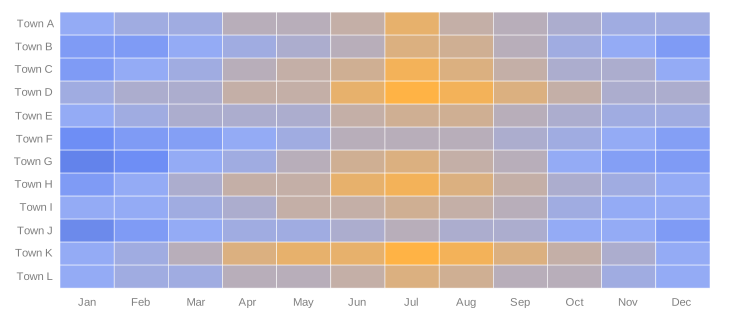 but with inverted axis and using hour of day instead of "town xyz"
