7 surprising tweaks to increase conversions (that you can use right now)
Want to increase your sales?
Try these 7 design tweaks (proven by split test wins):
1\. Keep selling on your pricing page
Most pricing pages just list their features.
This is wrong.
Instead, play up the value.
Conversion Rate Experts added more info on the pricing page. Specifically they:
- Kept selling
- Explained the service in greater detail
- Reduced risk with a guarantee
Result: increased leads by 57%.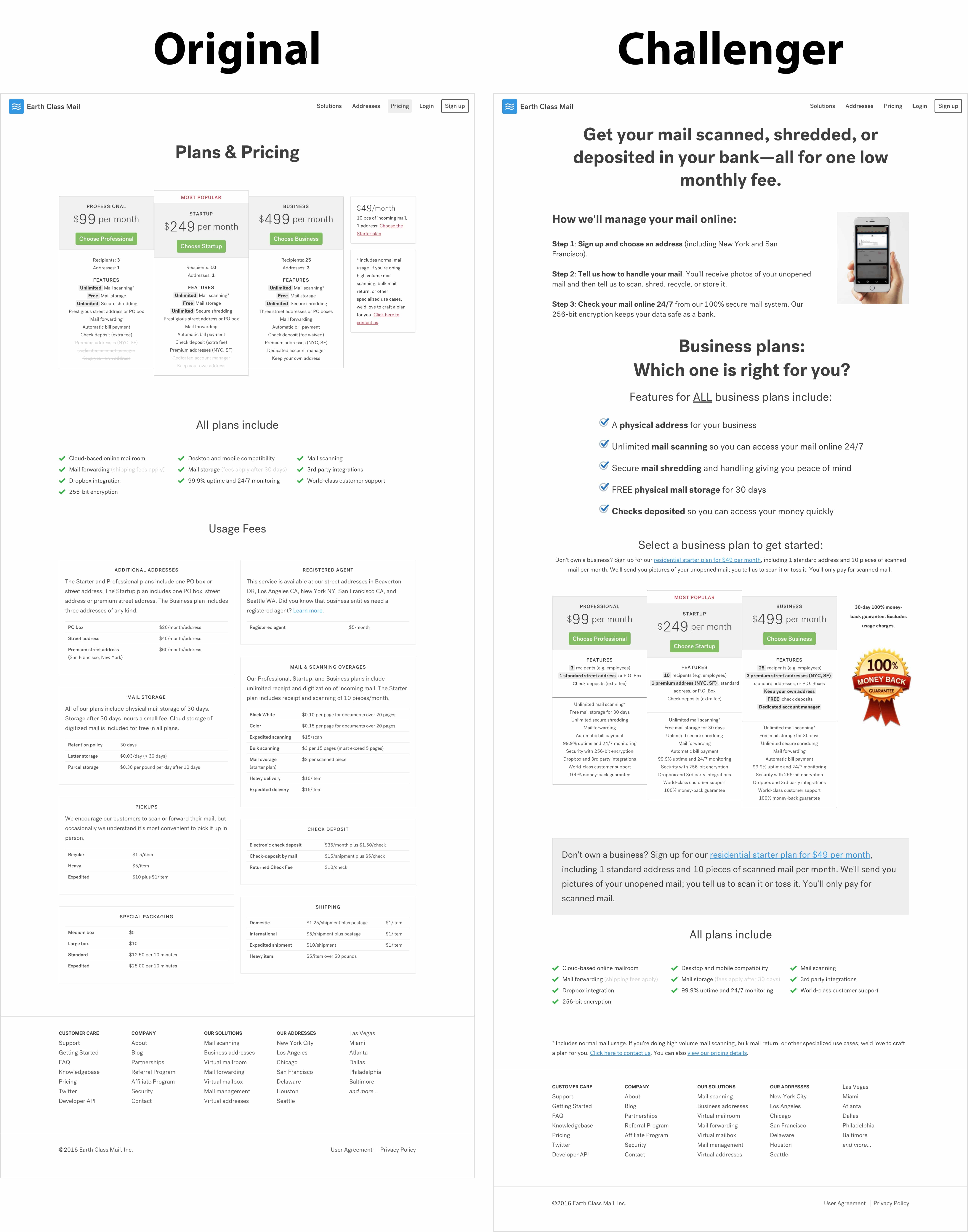
Note: this entire split test was set up in Convert. It's amazing what you set up with it!
2\. Use multi-step forms
Multi-step forms are almost a guaranteed win.
They reduce the perceived effort (since shorter forms seem easier).
They let you ask more questions (and improve lead quality).
They help users focus.
And they work.
Here's an example from Instapage of a single-step form:
Now compare that to the multi-step version.
Step 1:
Step 2:
Step 3:
Much easier, right?
And it paid off: The multi-step form increased leads by 18%.
3\. Give people a "sneak peak"
Your readers may not know what to expect from your newsletter.
So add a link to your recent issue to give them a "sneak peak."
Here are two examples (courtesy of The Newsletter Newsletter):
4\. Start with the easiest step
Many online forms ask for contact details first.
This is wrong.
It puts the biggest commitment upfront.
Instead, start with the easiest step.
Here's a great example: CXL tested three variations of a form.
- Variation 1 tried a new design.
- Variation 2 removed all fields except email.
- Variation 3 removed the name field and moved the email field to the end.
Variation 3 increased leads by 44.7%.
Now you may be wondering: why didn't variation 2 win?
Simple: despite having only one step, it was still a big leap for users.
Variation 3 "warmed" up people by asking which jobs there were interested in. So not only was it a small commitment (just tick a box), it also got people thinking about what they'd get in exchange for their email.
5\. Give people different ways to sign up
Different people sign up in different ways.
Some use Google.
Some use Twitter.
Some use email.
Make it easy for all of them to sign up using their preferred method.
For example, MarketingSherpa reported that adding a simple text link (that let people sign up with GitHub, Twitter, or a password) increased signups by 37.8%.
6\. Increase font size
Accessibility is often overlooked.
Digital.gov recommends a font-size of at least 16px (depending on the font).
Otherwise, many people won't be able to read it.
And if they don't read, the won't buy.
WebFX increased the font size of a client's site from 10pt to 12pt. The result? A 20% increase in conversions.
Accessibility for the win.
7\. Explain your benefits (and prove it)
Whenever possible, add more benefits and social proof to your pages. They almost always help.
For example, ConversionWise redesigned HubSpot's page. You can see how they loaded the page with new benefits---and backed up those claims with reviews and famous client logos.
Try one of these seven tweaks today. Chances are, it'll boost your sales.
Subscribe to Funnel Candy's newsletter for expert tips to grow your business (based on 1,000+ experiments on startups and sites like Amazon, Dropbox, and WIRED).
